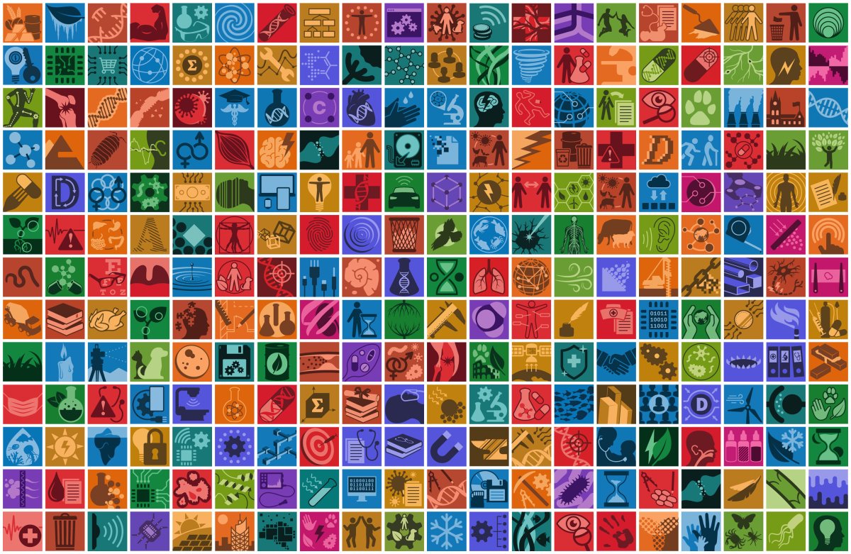
Journal Logos
Mini identities
At the heart of an academic publishing house lies the journals. At MDPI, each journal is run like a small independent company, and they all have a set of graphical assets created for them from their genesis. Central to that set is the journal logo: bound by a strict set of rules designed to keep family resemblance between de 480+ journals, this small square illustration will represent the essence of the journal and function as its face in all the platforms and formats needed. I was in charge of developing and maintaining this massive library of assets for various years, which is both a big technical challenge and hundreds of mini creative challenges.
The creation of journal logos involves achieving a tricky balance, in that it needs to be representative, unique, and satisfactory to the Editor-in-Chief of the journal, but also needs to remain within the constraints of the Journal Logo Guidelines that I’ve established.