Humano Obsoleto
Academic editorial assignment
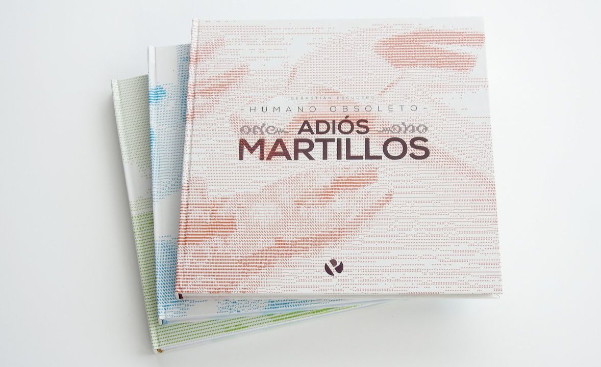
The task was to design the cover, opening pages, and index of a 3 tome collection of books, plus the first 50 pages of the initial tome. The most important requirement was that a very defined style, complementing the tone of the chosen narrative, had to be established and consistent across the entire project.
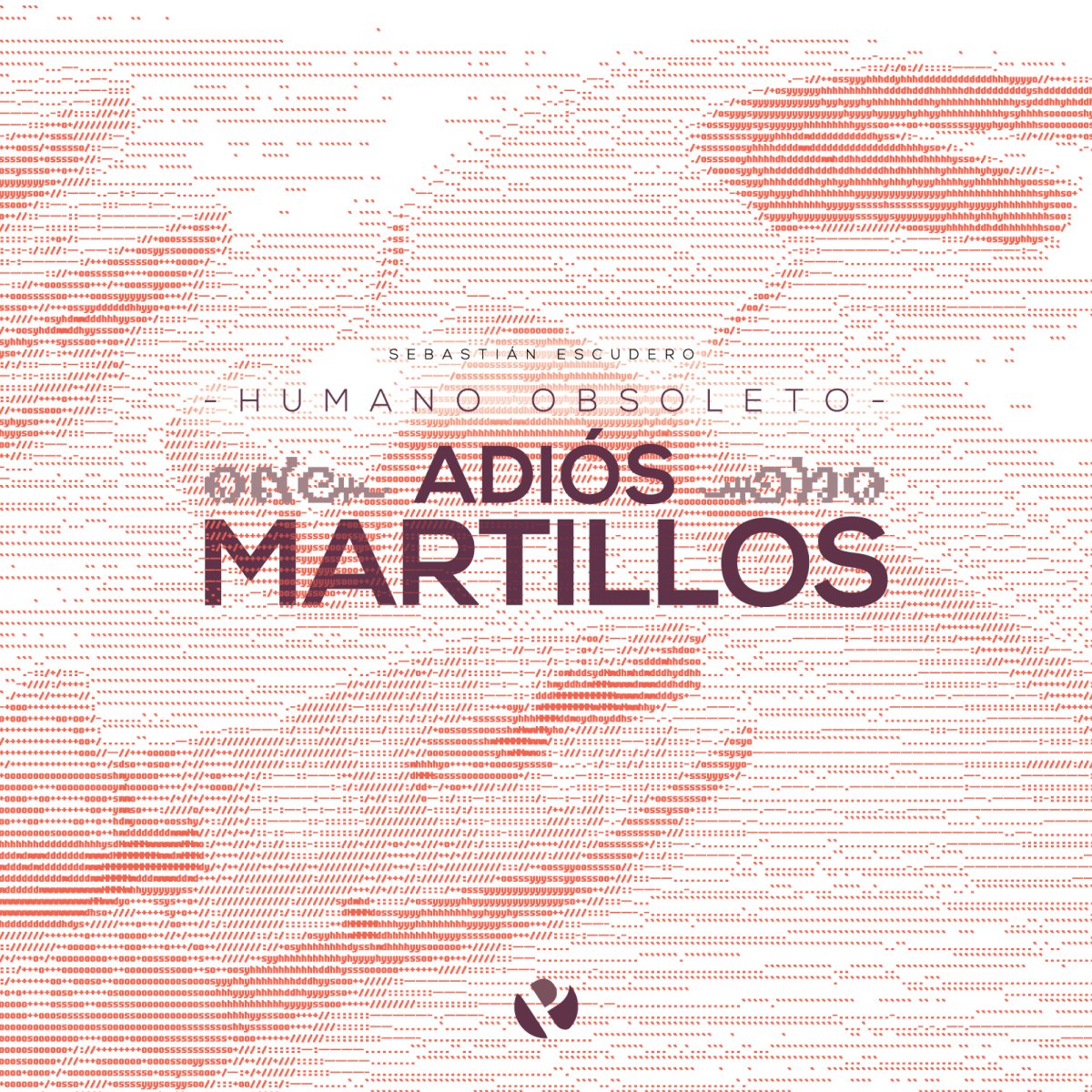
I chose to work with the effect of automation on the future of human labor and divided the tomes into manual labor (goodbye hammers), professional labor (goodbye ties), and artistic labor (goodbye paintbrushes). I wanted the collection to have an informative appearance, but a serious tone.
Colour
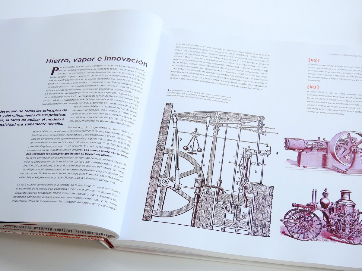
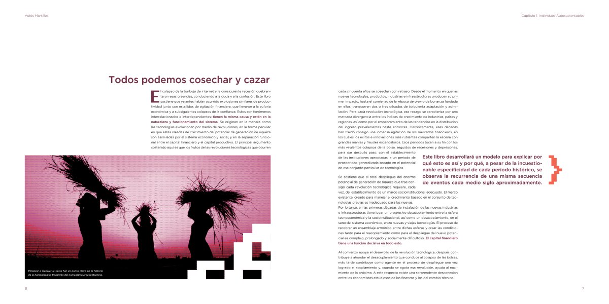
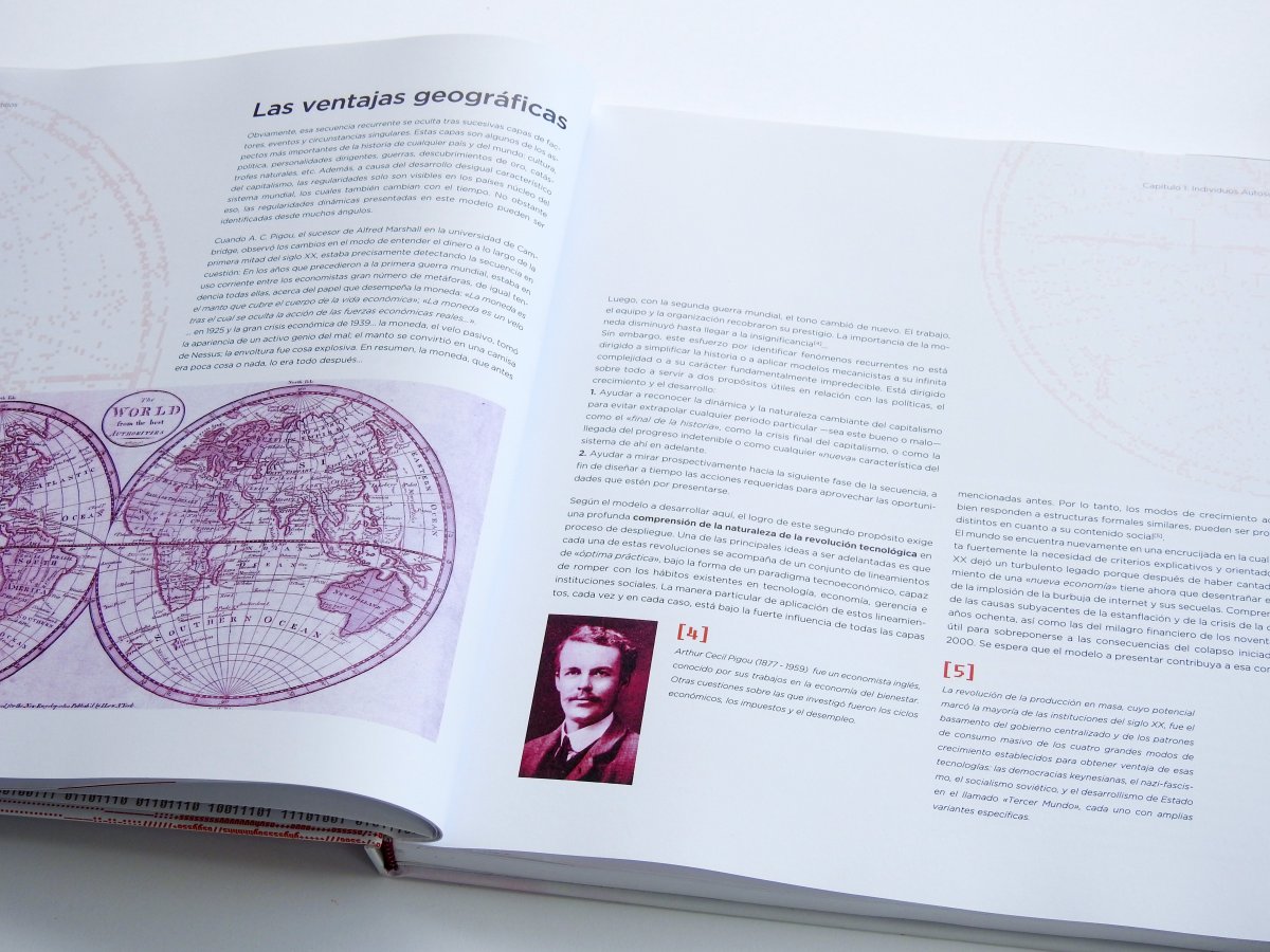
- Each tome uses only three inks: a primary colour, a secondary one, and black.
- Titles, subtitles, and highlights appear usually in the primary colour.
- Images are mostly converted to duotone using the primary colour and black. Miscellaneous elements and other details are used mainly in the secondary colour.
- The base text is always black.
Typefaces
Only 3 typefaces are used in this whole project:
- Nexa Bold, for titles and subtitles
- Gotham Light for the base text, with its medium variant for highlights
- Fixedsys Excelsior, for miscellaneous elements and other details.
Resources
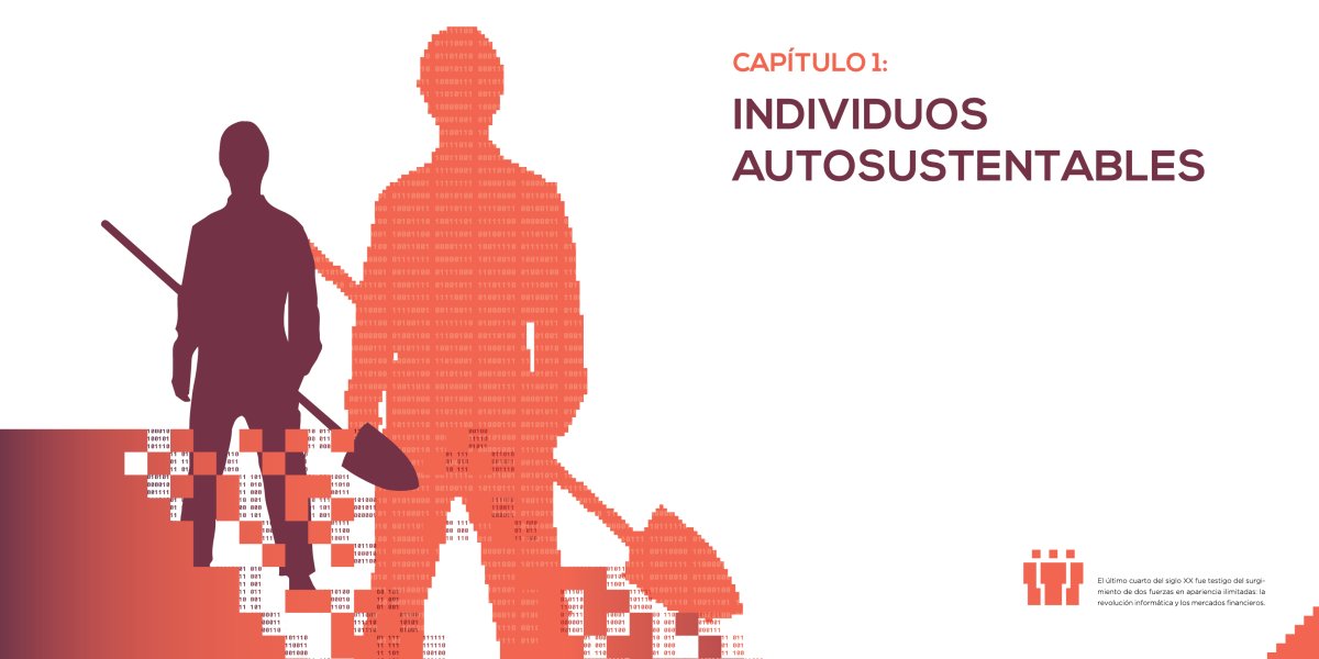
The main resources I use to define the visual style of the whole collection are ASCII art, pixelated elements, and binary code.
The first is most notable in the three covers, which are pictures I converted to ASCII sequences with a web tool and a lot of patience.
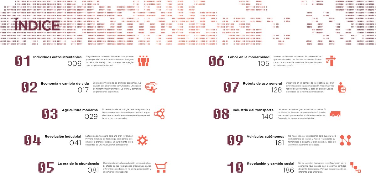
Pixelated elements are mostly used as ornaments, but there's also a system of pixel icons that identifies each chapter of the tomes.
Binary code is used on the endpapers, chapter covers, and other smaller instances to complement the style.